
It’s amazing how much can change in 10 years! The world goes through dynamic transformations constantly, and as we like to teach our youth: you always have to get your game up, because it’s game on! Our brand for 10 years has served us well, but we knew it was time to “sharpen our tools” in readiness for what’s ahead.
Our brand consultant and designer, Aislinn, shares her account of how we did it.
“Asante Africa Foundation is a wonderful organization that supports education in East Africa. They are on a trajectory that will allow them to expand the good work they do in the coming decade. I was brought on to assist their team in generating a new logo and visual identity — complete with Graphic Standards that would guide them in redesigning their website. My role in the project was twofold: first, I brought guidance to the process of distilling goals and brand equity into concise direction; then, in the second stage, I did the graphic design that brought this new identity to life.
New Logo — What it means!
This new identity for Asante Africa is designed for multiple audiences, global use, professional presentation, and scalability. The logo in this new system is a two-component lockup that pairs the “Asante” logotype with a round badge. The badge may be used solo as a decorative, navigational, or iconic element. This pairing strategy allows the Asante Africa team to flex and evolve the identity without breaking it — additional badges could be developed for key programs as the foundation grows, for example.
The team came to me with a need for a more “education-centric” identity. We met that need by constructing a symbol-driven badge reminiscent of diploma seals, civic emblems, and local beadwork. The book, pencil, and sunburst elements all represent intellectual development. The tree represents life, growth, knowledge, and strength. For the US-based audience, the Acacia tree is also an African icon; a fact reinforced by the continent’s counter form among the branches.
The hand-drawn quality of the logotype (retained from the old logo) infuses a sense of the rustic, human, youthful, and organic into Asante Africa’s identity.
The “heart” and “warmth” of the previous logo was a must-have for the new work. Equity from the old logo was carried through to the new system by our choices to preserve the “Asante” logotype, evolve the tree imagery, and continue with an illustrative approach. These choices bridge the old and new visuals in a way that provides continuity for the organization.

Program Colors — What they signify!
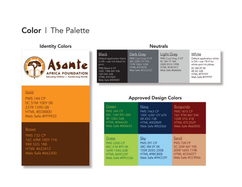
The new visual identity was designed to be approachable and authentic. The warm, earthy colors connect to the natural and classroom environments. They also carry hospitable, social connotations in both the African service region and the US-based supporting community.
I’m proud of the work we’ve done and that which the Asante Africa team continues. The soul of the organization comes through brilliantly and the tighter execution elevates the brand to a level commiserate with the value of their mission. I feel lucky to have worked with Asante Africa because this project was, in effect, a way for me to pay forward the gifts I’ve received in my own education.”
By Aislinn Race
Aislinn is a brand consultant and designer from California. She is passionate about helping not-for-profit organizations and businesses put their best foot forward. www.aislinnrace.com